After finishing up the recent flurry of activity and taking a couple weeks off from serious site development, I decided to ease back into things with a "fun" feature addition: Consumption Graphing! Available via the Consumed area in anyone's cellar (see the new "View Graphs" button in the header), these charts are a preliminary pass at illustrating your consumption habits and history visually.
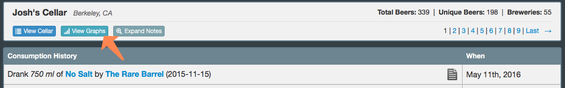
Click the above button in your Consumed area to display the charts below.
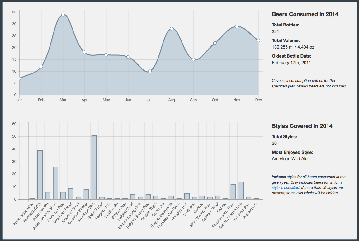
For now I'm featuring the two graphs above, Beers Consumed and Styles Covered. Graphs can be viewed on a per-year basis for every year you've been a member of the site, and graph values provide more information on hover. The Consumed graph charts your per-month bottle consumption for the specified year, while the Styles graph shows the styles represented by the bottles consumed in that year. In addition, some extra data is displayed alongside each graph, such as the total volume of beer consumed or your favorite style that year.
You'll also notice a new "Share" button on the Graphs page with an informative tooltip. As is also possible with the Cellar and Consumption History pages, all you need to do to share the new Graphs page is copy the URL and share it with whomever you'd like! As long as your cellar isn't marked as private, anyone can access this new area for any existing cellar.
I have some ideas for further graphing, e.g., total cellar size over time, brewery representation breakdown, and possibly some trade-related graphing, but I'm happy with this simple presentation for round one. If you notice any issues or have any suggestions, please feel free to let me know, as always. Otherwise, I hope you enjoy this new way to view your consumption habits!